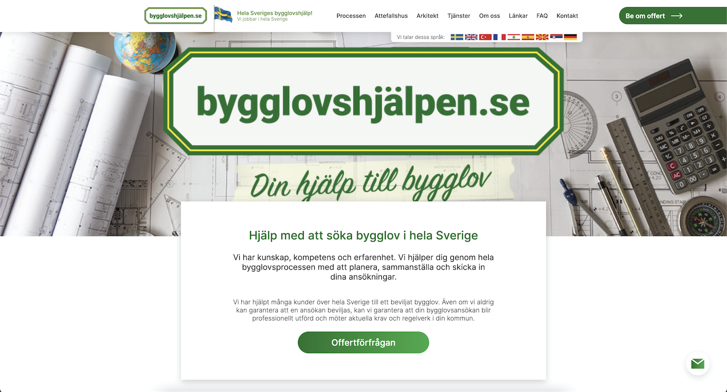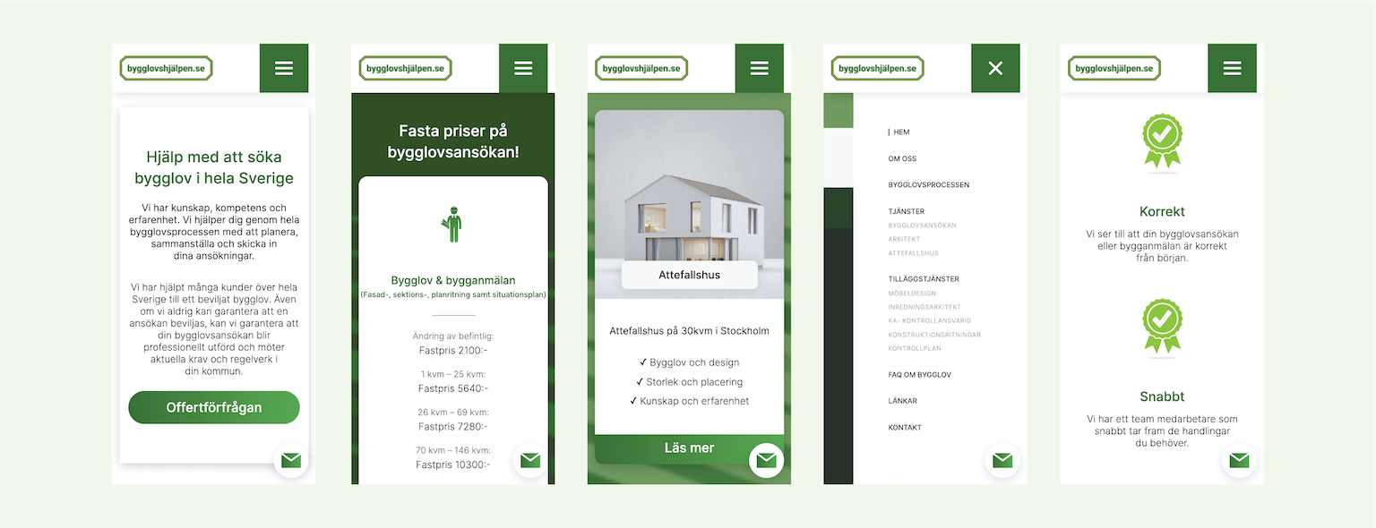
A new digital presence, designed and developed for one of Swedens leading companies within building permit assistance.
Digital Rebranding, Business website
Customer turn over was one of the key reasons for a rebranding. The client didn't want a completely new identity but rather repack some of the old website's look and feel into a new package, so that recurring customers would feel a sense of familiarity.
The site was the developed through WordPress, as per the client's request. It was important to have the ability to update and maintain the content of the page independently.
It was important to be seen as a serious, stable and modern company that could be trusted.
While keeping some of the general feel of the old website, a new one was built, more modern, more clean.
Bygglovshjälpen

Same brand, new website
The main focus was to use the elements and content from the old website, redesign it and make it fit the modern updated vision of the company.

Modern components
To keep some recognition factor from the previous website, we kept most of the overall structure and remade outdated components. Adding some gradient hovers and, fullscreen backgrounds and smooth accordions.

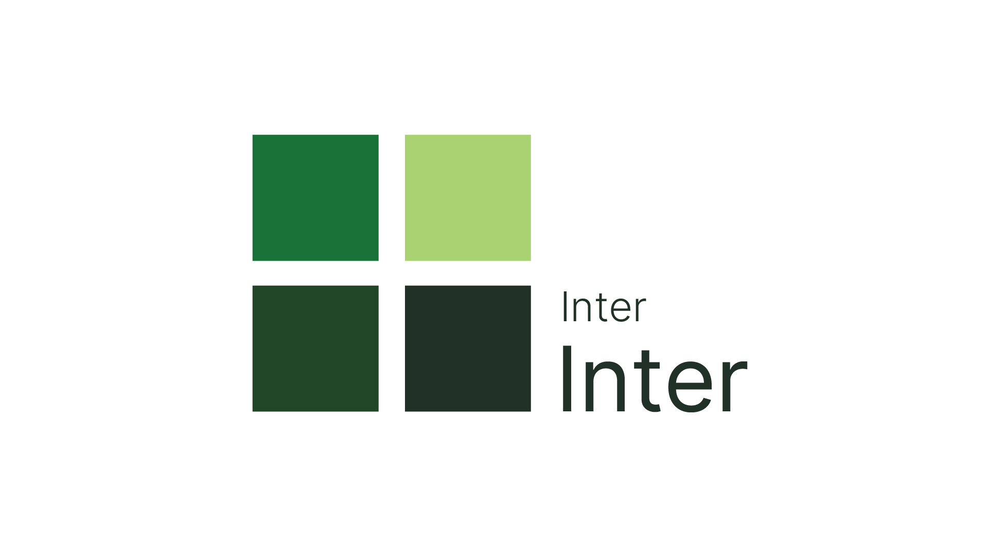
Shades of green
Green stands for balance, nature, and rebirth. It’s the symbol of prosperity, freshness, and progress. To make the new design more vibrant we used the old green, and developed a few shades that would accompany it.


